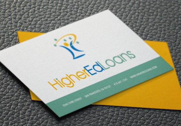
Higher ed loans LOGO
Overview
HigherEdLoans was a startup in the educational financial assistance space, helping to aggregate and crowdsource the best consolidation loans for students with multiple existing student loans. They wanted to avoid the stodgy feel of a financial institution in favor of a fun, colorful, whimsical image that would appeal to a college-age demographic.
Sketching
I scribbled out a fair number of roughs, mostly revolving around the concept of money, and various old 'college' tropes. None of them were really speaking to me until I abandoned the money and the graduation concepts and instead started thinking about juggling. Yes, juggling — as in, balls in the air, as in a bunch of loans to manage. I played around with several variations of this idea, until finally hitting on the right balance of whimsy and meaning.
FinalizING THE LOGO
I utilized a subtle, stylized version of the H, E, and L of the company name, and formed a figure out of them who is precariously juggling multiple green circles. We named him, simply, 'Ed'. The combination of green, blue, and gold symbolizes money, stability, and success. It was clean, clever, meaningful; solid enough to age well and generate trust, but fun enough to get attention from the target. It was a hit, both with the client and the students they approached for feedback on the design.


