Visual effects society Website
Overview
The old site: cluttered, heavy, dark, disorganized, dated. Lots of great content, but nearly impossible to find any of it.
Visual Effects Society is an organization with an international membership of VFX artists working in film, gaming, and other entertainment. Their old website had a wealth of information for visual artists, but it was disorganized and haphazardly thrown together over the years, making much of the content difficult to find. Their analytics showed that most members accessed the site for the first time and then never again, despite the wealth of articles, tips, and useful industry information available. The company was looking to clean up and reorganize the site in a way that made sense to users, and they wanted to increase engagement with their membership as much as possible within a legacy system and a limited budget.
My role was to reimagine and redesign the site; I worked with their developer contractor who would be building everything in their existing Drupal framework.
RESEARCH
The client was able to provide contact information for several of their members, so I put together an interview script and began making calls. The data points I discovered were fairly consistent: most users rarely visited the site at all; they didn't see much point. It was exceedingly difficult and time-consuming to find relevant information; even though a lot of what they might be seeking was there somewhere, there was no easy way to locate it. The filing system was a bit of a mess, and if there had ever been any sort of coherent taxonomy developed, it had long ago been overwhelmed with random placement and confusing verbiage.
CONTENT ORGANIZATION
The first order of business was to inventory the existing content. This was potentially a herculean task, given the sheer volume of material, so we opted to focus on items that were less than two years old. Everything else would go into an archive area, searchable by keyword.
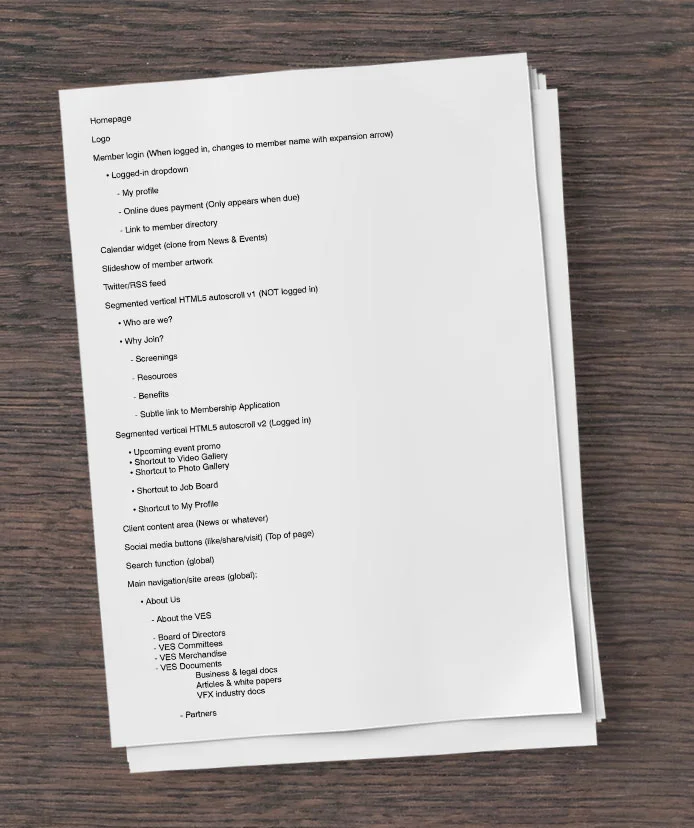
I set up an online card sorting exercise and asked several VES members/users to participate (our budget precluded anything beyond a small volunteer effort, but it helped). I created a rough outline based on the results of the exercise, and we ended up with seven main global navigational categories with up to two layers of subnavigation, plus some footer nav elements and a keyword search field for all the content, including what would now be the archives.
Having wrangled the existing content into sensible categories, it was time to address the issue of member engagement in the site.
MEMBER PROFILE
In my initial conversations with members, it was clear that the problem with engagement was twofold: first, the site’s disorganization made it less than useful; and second, the content was all for one-way passive consumption. In other words, while there was much to read and/or watch, the only interactivity available was commenting on articles or videos. I thought it might be a good idea to create profile pages where members could post their latest work and talk about it, and generate discussions around that. I also thought it would be advantageous to randomly feature members’ work on the homepage, and link it to that member’s profile. After all, these are video effects artists; one would assume they would love to show off their work to an audience of their peers and potential colleagues. I ran these ideas by the group of members I had interviewed, and the response was overwhelmingly positive.
LAYOUT
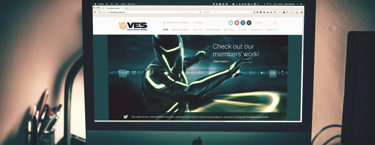
I sketched out a few options for a homepage layout to test the client’s interest in my approach. The sketches were received well, and a direction was selected for further exploration. The main hero of the page would be the featured member artwork, which would link to the profile of the member of the day/week/etc.
The proposed new layout was much cleaner and more compelling than the old site, with less clutter and nicer visuals to grab attention and direct the focus downward to the various key featured content elements. Content blocks on the homepage would be excerpts linking to more information elsewhere on the site, and the navigation reflected organizational choices made by users rather than the previously somewhat random hierarchy.
WIREFRAMES/MOCKUPS
Since I had most of the content, and the client was happy with the way the design was proceeding, I went ahead and built out my hi-fidelity wireframes in Photoshop. At this point, the design was almost completed, but I wanted to run it by my user panel, so I sent them the mockups for feedback. There were a few slight modifications (and the addition of screens for mobile), and then the files were ready to hand off to the developer.


